
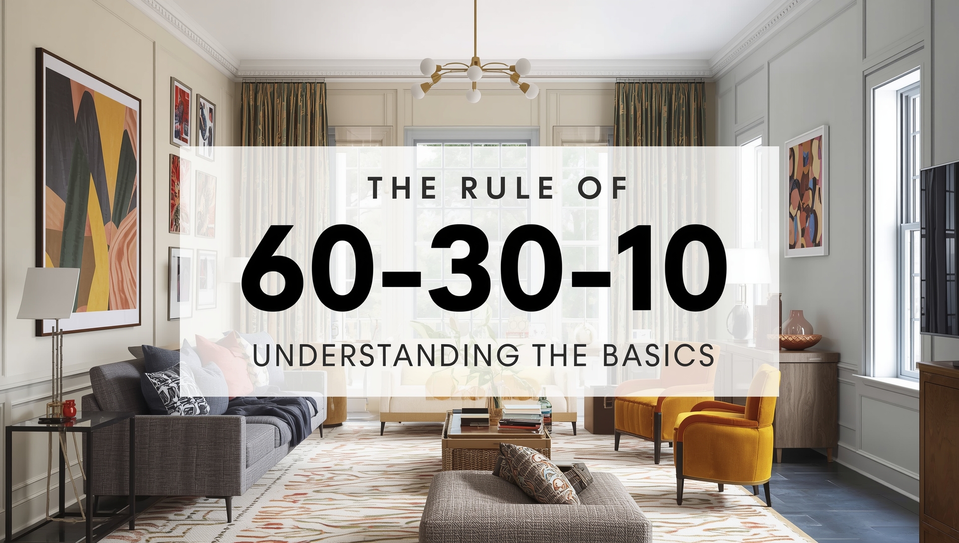
Creating a balanced and beautiful space often feels like a mystery — why do some rooms look effortlessly pulled together while others feel slightly off? The secret lies in one simple but powerful design principle:The Rule of 60-30-10 in Interior Design: Understanding the Basics .
whether it’s a cozy bedroom, a modern living area, or a minimalist office. Let’s break down what the rule means, how to apply it, and how you can use it to design your dream home like a pro.
🎨 What Is the 60-30-10 Rule?
The 60-30-10 rule is a classic interior design formula that helps achieve color balance in a space. It divides the color palette into three parts:
- 60% – Dominant Color
- 30% – Secondary Color
- 10% – Accent Color
This ratio ensures that your room feels cohesive, well-balanced, and visually pleasing. It’s the perfect blend of structure and creativity — a foundation that allows you to experiment while keeping everything in harmony.

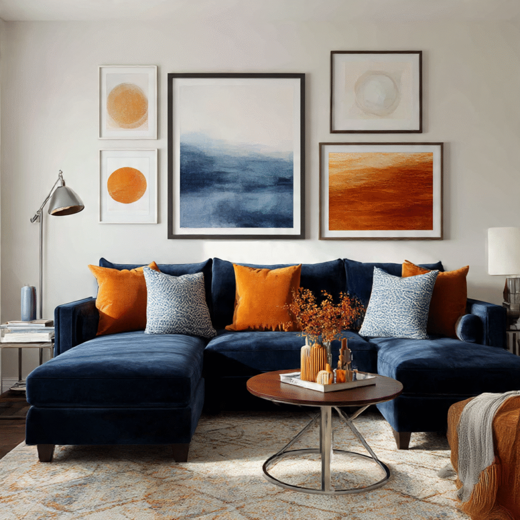
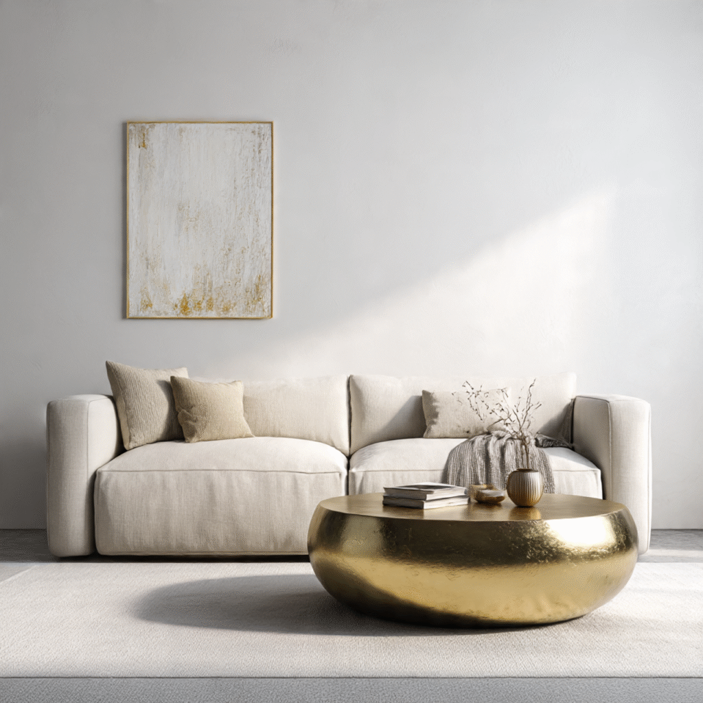
🖌️ 1. The 60% Dominant Color: Setting the Tone
The dominant color acts as the base of your design. It typically covers the largest surfaces in the room — like walls, rugs, and large pieces of furniture.
Choose a hue that reflects the mood you want to create: soft neutrals for calmness, deep blues for elegance, or warm earth tones for coziness.

💡 Tip: Neutral bases like white, beige, or gray offer flexibility to experiment with bolder secondary and accent shades later.
🛋️ 2. The 30% Secondary Color: Adding Depth
The secondary color supports and enhances the dominant shade while adding depth and dimension. This is often used for furniture, curtains, or statement walls.
If your main color is neutral, use the secondary tone to introduce contrast and personality — like pairing beige walls with forest green sofas or navy cabinetry.

💡 Tip: Choose a secondary color that either complements or contrasts the main tone — both can work beautifully when balanced correctly.
✨ 3. The 10% Accent Color: Creating Impact
The accent color is your opportunity to bring energy, personality, and surprise into the room. It’s used sparingly — through cushions, artwork, lamps, or decorative objects.
The key here is subtlety: even a little pop of bold color can transform a neutral space into something striking.

💡 Tip: Metallics like gold, copper, or silver can serve as accent colors too, especially in modern or luxury settings.
🎯 How to Apply the 60-30-10 Rule in Different Rooms
Living Room
Start with a neutral base (white or beige), add a secondary color like navy or olive for furniture, and finish with gold or terracotta accents.
Bedroom
Opt for a soft, restful base with muted colors. Add a deeper secondary tone for bedding or curtains and use small pops of color for cushions or lamps.

Kitchen
A crisp white kitchen can come alive with a secondary color like sage green cabinets and gold or matte black accents.

Bathroom
Balance calm neutrals with subtle contrast and metallic accents for a luxurious spa-like feel.

💡 4. Adjusting the Rule for Personal Style
While the 60-30-10 ratio offers structure, it’s not a strict formula — think of it as a starting point. If you prefer bold or eclectic interiors, you can tweak it to 40-40-20 or 70-20-10 depending on your comfort with color.
Experiment with patterns, textures, and finishes — matte, gloss, velvet, or linen — to add visual depth without overwhelming the palette.

🌈 5. Beyond Color: Applying the Rule to Texture and Materials
The 60-30-10 principle can go beyond colors — you can use it to balance textures and materials too.
For example:
- 60% smooth finishes (painted walls, marble floors)
- 30% soft fabrics (rugs, upholstery)
- 10% metallic or natural accents (brass lamps, wooden décor)
💡 Tip: This variation keeps the room visually balanced and tactilely engaging.
🖼️ 6. Testing Before You Commit
Before painting or purchasing major furniture pieces, create a color mood board. Collect samples of paint, fabric, and décor to visualize how your palette interacts.
You can also use free design tools or apps that simulate your color scheme to avoid costly mistakes.

🏠 7. Common Mistakes to Avoid
- Using too many colors: Stick to three main tones for harmony.
- Ignoring undertones: Warm and cool tones can clash if not matched properly.
- Overdoing accents: Keep accent pieces minimal — they should highlight, not overwhelm.

🌟 Conclusion: The Simplicity of Beautiful Balance – The Rule of 60-30-10 in Interior Design: Understanding the Basics
The Rule of 60-30-10 in Interior Design: Understanding the Basicsis one of interior design’s simplest yet most powerful secrets. It brings clarity to creative chaos and ensures every room feels intentional and cohesive. Whether you love minimalist neutrals or bold color contrasts, this ratio helps tie everything together with ease.
The beauty of design lies in balance — where every hue, texture, and material finds its rightful place. Once you master the 60-30-10 rule, you’ll notice how effortlessly elegant your spaces become. It’s not about perfection, but about creating harmony that feels natural and timeless.
So next time you pick up a paintbrush or choose décor, let this rule guide your instincts — and watch your space transform from ordinary to extraordinary.